
Brief / LYK is a social media platform that focuses on privacy and user rewards. They recently hit 500,000 download in India and now want to expand their US Market
Responsibilities / Usability Testing & User Research, Product Designer
Responsibilities / Usability Testing & User Research, Product Designer
This was a 12-week capstone project at Northeastern University to help LYK (A social media platform with privacy setting) improving their digital marketing strategies for the US market. We performed user researched, heuristic review, usability testing, user experience design and developed recommendations to implement new key improvements.
PLANNING
The whole 12-week was dived into 3 phases, with each phase focused on a specific problem and
- Phase 1 (5 weeks): Analyzed the platform and performed usability test. Identified the right targeted demographic and personas for LYK.
- Phase 2 (4 weeks): Evaluated the marketing copies on App Store and designed new mock-ups to improve this critical page’s conversion rate and hence to help LYK attract users faster.
- Phase 3 (3 weeks): As a product designer, suggested new features that could help LYK get traction.

User Persona & Customer Journey


Product Design (A/B Version)
We decided to try to design 2 versions of the social media platform. The first version, or version A, would focus on just some certain features and improve some user interface layouts for better user experience.
Meanwhile, version B would have a completely new visual design and concept, which focuses on giving a fresh upgrade of the current social media platform and a whole new user experience.
Meanwhile, version B would have a completely new visual design and concept, which focuses on giving a fresh upgrade of the current social media platform and a whole new user experience.
Version A
For this version, we focused on changing some of the user interface layouts, based on user research.
Rewards Feature
• One of the problems that the Rewards Feature has was the unorganized coupons/vouchers.
• The new design has all the brands grouped into different categories.
• When users access each brand, they'll find different types of coupons, which could help increase better user experience.
Before
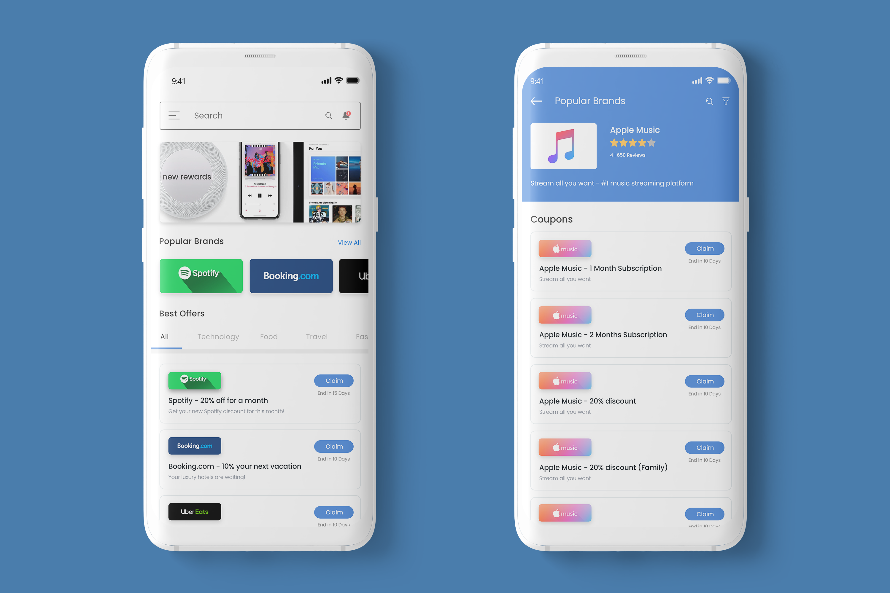

After
App Store Screenshots
• For the version A, we decided to gain our unique positioning by promoting & focusing on Wallet Point system, which rewards the users for the time they spend on our social media platform.

Version B
The customer journey played a big part of the design progress for version B. We wanted to have a new user interface that could help users navigate to the content they want to see.
On boarding
• The new onboarding will appear after login/sign up screen.
• Using real copies from the actual social media platform to explain the app's features.
On boarding
• The new onboarding will appear after login/sign up screen.
• Using real copies from the actual social media platform to explain the app's features.

New UI layout
• Separate content in different categories, according to users' interests.
• Giving a sense of community.

App Store Screenshots
• For the version B, we decided to focus on certain features that stand out compared to other social media platform to attract new users.
App Store Screenshots
• For the version B, we decided to focus on certain features that stand out compared to other social media platform to attract new users.
